Actage: A Clean Display Font for Digital Branding
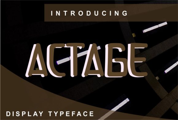
As a UI designer who ships dozens of landing pages, SaaS dashboards, and e-commerce sites each year, I pay close attention to how a typeface behaves—not just how it looks. Actage stands out because it’s not merely decorative; it’s purpose-built for clarity, adaptability, and digital presence. It’s a display font with strong geometric roots, clean terminals, balanced letter spacing, and subtle warmth in its curves—making it feel both modern and approachable.
Unlike many display fonts that sacrifice legibility for flair, Actage maintains strong x-height and open counters, which means it holds up exceptionally well on screens—even at smaller sizes within responsive layouts. On hero sections, it delivers impact without visual noise. On mobile, it remains crisp and scannable when used for headlines above 24px, especially with appropriate line-height (1.2–1.3) and letter-spacing (0.5–1px for uppercase use).
I reach for Actage when I need to establish tone quickly: confident but not cold, creative but not chaotic. It works beautifully for brand names in logo lockups, product headlines in online stores, and headline treatments in course sales pages. For a boutique skincare brand, I used Actage for the hero title “Pure Radiance” over a soft gradient background—its clean forms contrasted cleanly without competing with imagery. For a coaching website, it anchored the CTA button “Start Your Journey” alongside a neutral sans serif body font, reinforcing intention without shouting.
Actage shines most where hierarchy matters. Use it for primary headings (h1), section dividers (h2), or short, high-impact phrases like “Limited Seats,” “New Collection,” or “Join 5,000+ Designers.” Avoid using it for long paragraphs, navigation labels, or form fields—it’s not a text font, and forcing it into those roles undermines both usability and brand cohesion. Its strength lies in brevity and emphasis.
Readability across contexts is reliable. On light backgrounds, it reads cleanly at 32px and up. On dark mode interfaces, ensure sufficient contrast—test against WCAG AA standards (minimum 4.5:1). When overlaid on photography or video banners, add a subtle semi-transparent background or text shadow to preserve legibility. For small CTAs or pill-style buttons, stick to sentence case and avoid all-caps unless the weight supports it (check included styles—Actage typically includes Regular and Bold, sometimes with alternate glyphs for stylistic flexibility).
Font pairing is where Actage truly earns its place in your design system. Pair it with a highly legible sans serif—like Inter, Manrope, or even system fonts (SF Pro, Segoe UI)—for body copy, captions, and interface text. This creates clear visual separation: Actage sets the voice, the sans serif handles the conversation. For editorial or luxury-focused digital experiences, try pairing with a restrained serif like Lora or Crimson Text—but only if the serif has generous spacing and low contrast, so the combination feels intentional, not cluttered.
It’s also versatile across formats. Actage exports in WOFF2 (ideal for web performance), OTF, and TTF—so you can embed it cleanly in websites via @font-face, use it in Figma auto-layout components, or drop it into Canva templates for social media graphics. Most licenses include multilingual support covering Latin Extended-A, meaning it handles accented characters for Spanish, French, German, and Portuguese—critical if your audience spans regions or your SaaS tool serves global users.
For designers building client-facing assets—landing page templates, Notion brand kits, Shopify themes, or Figma UI libraries—verify the license covers commercial use, web embedding, and redistribution. Some Actage licenses permit unlimited projects for one designer; others require extended licensing for white-label templates or SaaS platforms where end users generate branded content. Always check the EULA before shipping a client site or publishing a digital product.
In practice, Actage helps solve real layout problems. On a portfolio site, it gave structure to project titles without overwhelming the work itself. In an online course dashboard, it differentiated module headers from lesson descriptions, guiding learners intuitively. For a newsletter banner, its clean geometry made “Free Workshop This Friday” feel urgent yet trustworthy—not gimmicky.
What makes Actage different from other display fonts isn’t just aesthetics—it’s intentionality. It avoids excessive contrast, exaggerated serifs, or unpredictable alternates. That restraint gives it longevity. You won’t tire of it after three months of use. It doesn’t date quickly. And because it’s built for adaptability—not just print—it scales gracefully across devices, modes, and contexts.
If you’re choosing a display font for a new brand identity, consider how often you’ll reuse it—not just in headers, but across email subject lines, app splash screens, social profile bios, and PDF pitch decks. Actage performs consistently across all of them. Its file size stays lean, its rendering is predictable in Chrome, Safari, and Firefox, and its personality remains coherent whether viewed on a 27" monitor or a 6.1" iPhone.
Finally, remember that typography is never neutral. Every font choice signals something about your brand’s values: precision, warmth, authority, playfulness. Actage communicates clarity, confidence, and quiet sophistication—without demanding attention. That’s rare. And in digital spaces crowded with visual noise, that kind of calm authority is one of the most valuable design assets you can deploy.